For the longest time, I’ve relied on the dynamic view template for this blog. It was less fuss than the previous ones. Still, each time I visited Around the Corner, I found myself wondering, “Where’s the world map showing all the visitors and where they are from?” Google’s Blogger dashboard just wasn’t getting the job done, but I decided to leave it alone.
The Google View
The Google view of the blog stats is, well, kinda boring. It looks like this:
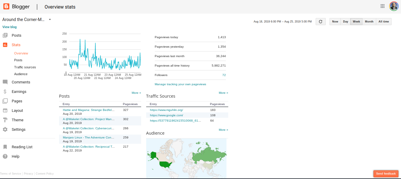
While this looks awesome, I found myself missing the globe and my Statcounter overview. More importantly, while Google’s stats view appears to highlight where people are from, I have NO idea where exactly in the U.S. people are coming from or what IP address or anything like that.
Back to Statcounter and Globes
If you’re wondering what Statcounter looks like on the backend, it’s a rich source of data. For example, Statcount has an awesome visitor map that you can look at full screen:
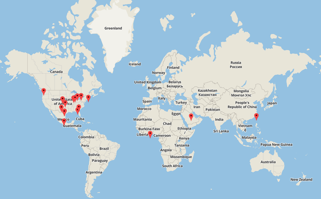
Isn’t that cool? What’s more, I’m actually able to see the IP address of where people are coming from. While these may be crude tools to what more organization-backed sites use, I LOVE the info provided.
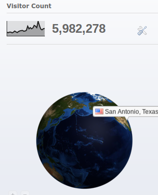
If I throw in a Revolver map, as well as the Google Blogger visitors count, I’m able to see where in the world people are coming from and how many folks have shown up. I’m counting down to six MILLION visitors since I first started using Blogger way back when. That’s incredible.
The dynamic view Google provided just didn’t give me the info I wanted. As a result, I went a bit retro so I could embed HTML/Javascript on the page. So, if you visit Around the Corner-MGuhlin.org blog, you may notice a different look. Now you know why.
Discover more from Another Think Coming
Subscribe to get the latest posts sent to your email.
