It’s kinda hard to imagine the Fediverse, but here are two visualizations that caught my eye over the last few weeks.
1 – Mapstodon
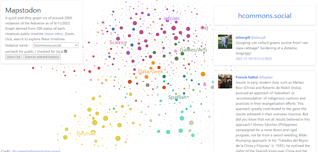
This one comes from comeetie, and is pretty interesting. At the link, comeetie also shares the notebook behind the app if you are interested in the code.
You can see a drop-down menu on the left sidebar so you can choose the instance you’re interested in. I chose hcommons.social, which is the instance I’m on now, and it gave me the right sidebar to view.
2 – Hachyderm.io
The other view is the Hachyderm view via Kris Nova. I love the spider web effect of all the instances…I did a quick search on hcommons.social (nothing came up), and mstdn.social gave an error on search. I probably didn’t do something right.

It provides some really interesting information in regards to instances, as you can see below:
 |
This list of instances is ordered by total number of users…again, lots of interesting data about Mastodon instances, especially the user counts.
Have you seen any other ways that Mastodon instances are being visualized or mapped?
Discover more from Another Think Coming
Subscribe to get the latest posts sent to your email.
